The Power BI August 2026 update is here, and there are quite a few new features to explore.
As always, some updates are more exciting than others. Some are small improvements that make everyday work easier, while others can change how we work with reports or Power BI projects. I went through the update, and these are my personal top 6 features.
1. Center value in the donut chart
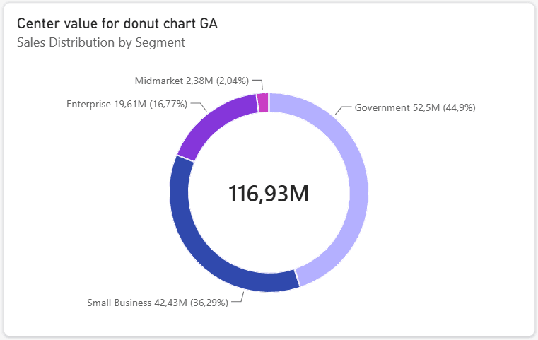
Finally, we can display a value directly in the centre of a donut chart.
If you have ever created a donut chart with a number in the middle, you probably know the workaround. You had to add a separate Card visual, place it in the middle and hope everything stayed in the right position when the visual was resized. Now the centre value is part of the donut chart itself.
It can respond to filters and other interactions, and you can format it directly in the visual. For me, this is one of those small features that should have been available a long time ago.
I know it is not a huge update :), but I can already imagine how many Card visuals I will no longer have to place on top of donut charts.
2. Outer padding for charts
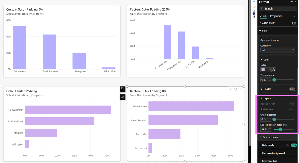
We can now control the outer padding for bar, column, line, ribbon and waterfall charts. At first, this might not sound very exciting. But if you care about report design, you know how often small spacing issues can be annoying.
Sometimes the chart itself looks fine, but the spacing around it does not. The data can feel too close to the edges. There can be too much empty space. Or, when space is limited, you might have a category that does not fit properly.
Until now, we had to accept the default behaviour. Now we have more control.
3. More individual customization for slicers
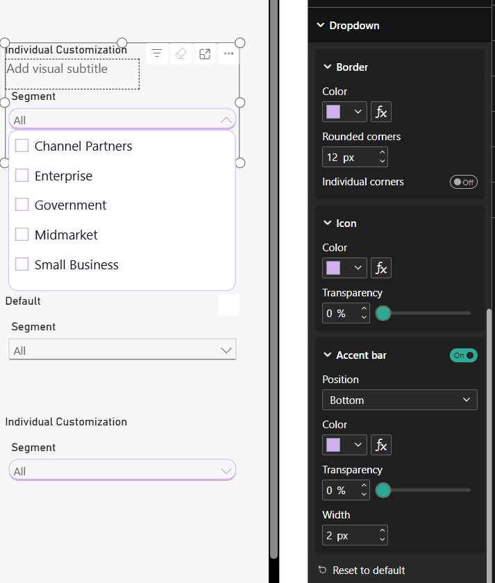
Slicers are getting more formatting options. You can now customize things like the dropdown border, corner rounding and icons. For hierarchy slicers, you can also control the colours of the expand and collapse icons.
This also applies to the Text Slicer, which I think is a really nice change. The Text Slicer looked different from the other slicers, so it was sometimes harder to create a consistent design.
I spend quite a lot of time working with report design, so I am happy to see more options like this. Slicers are everywhere in Power BI reports, and more control means fewer workarounds.
4. More control over refresh in Power BI Service
This is probably my favourite feature from this month’s update. The Refresh button in Power BI Service now gives you three options:
- Refresh schema and data
- Sync schema only
- Refresh data only
You can also perform refresh operations at the table level.
I like this change because sometimes you simply do not need to refresh everything. Maybe you changed the schema but do not need a full data refresh. Or maybe you only need to refresh the data. Now you have more control over the process instead of treating refresh as one big action. For me, this is one of the most practical features in the August update.
5. Better PBIP development with Visual Studio Code
The PBIP improvements also caught my attention.
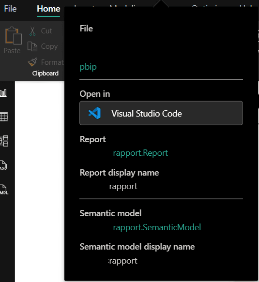
Power BI Desktop can now detect changes made to PBIP project files outside Power BI and lets you apply those changes directly. You can also open the project in Visual Studio Code from Power BI Desktop.
This is especially useful if you work with PBIP, Git or external development tools. Previously, changes made outside Power BI could mean reopening the project to see them. Now the workflow is a bit smoother.
I am personally interested in seeing Power BI move more towards development workflows that are already common in software development. PBIP, version control and external tools are becoming more important, so I think improvements like this are worth watching.
6. Themes are now generally available
The new theme experience is now generally available.
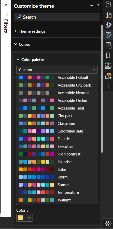
Modern visual defaults and the Theme pane give us more control over how reports look from the start. You can set defaults for visuals, choose colour palettes and control formatting such as backgrounds, borders, header icons, tooltips and shadows. You can also customize a theme and use it across your reports.
For me, this is important because I really do not enjoy formatting the same things again and again. If you already know how you want your reports to look, having better theme options can save a lot of time. It also makes it easier to create a consistent design across multiple reports.
Final thoughts
The August 2026 update has more features than the six I mentioned here, but these are the ones that stood out to me the most.
My favourite is probably the new refresh control in Power BI Service. I also think the PBIP improvements are interesting, especially for people working with Git and external tools.
But I am still very happy about the donut chart. Sometimes the small things are the most satisfying, especially when they replace a workaround we have been using for years.
You can read the full list of updates in the official Microsoft Power BI August 2026 Feature Summary.
If you missed my previous post, you can also read about the Power BI July 2026 update here: July update
Which feature from the August update is your favourite?