
My journey in
Data Analysis
Welcome to my professional portfolio! I am a data analyst based in Trondheim, and here I share my projects, skills, and experience. Explore how I utilize data analysis tools such as SQL, Excel, R, and Power BI to solve complex problems and contribute to business insights.

About me
I am a motivated data analyst with experience from practical projects in data analysis and customer service. I have strong skills in Excel, SQL, Tableau, Power BI, Python, and R. Through projects published on GitHub, I have demonstrated how data can be used to uncover insights and support decision-making. In addition to my professional skills, I run a growing Discord community for data enthusiasts, which has reached 400 members in just three months. The community focuses on sharing knowledge, solving challenges, and offering resources for career growth in data analysis. I am seeking my first job in data analysis, where I can contribute to solving business problems and improving processes through data.
Portfolio
Here is an overview of my data analysis projects. I have worked with various tools such as SQL, Excel, Power BI, Tableau, Python, and R to analyze data and create insightful solutions. Each project demonstrates my ability to handle complex datasets, create interactive visualizations, and draw meaningful conclusions that support decision-making in organizations.
Exploring Hotel Booking Patterns and Cancellations: Insights from a 2017-2018 Dataset
Structure and Scope of the Dataset:
The dataset consists of 36,275 unique booking records from a hotel management system. Each record contains multiple features, such as the number of guests, type of room, meal plan, and booking status. It covers booking details from 2017 to 2018 and provides insights into customer behavior, booking patterns, and revenue generation.
The dataset provides insights into key aspects of the hotel’s operations, such as:
Customer preferences (e.g., preferred room types and meal plans)
Booking frequency (e.g., booking trends by day of the week, month, and holiday periods)
Cancellation behavior (e.g., previous cancellations and cancellation rates)
Revenue generation (e.g., price fluctuations and segmentation by room types)
Tools and Technologies Used:
🗂️📝 R: for data cleaning, transformation, and preliminary analysis
📊 Power BI: for data visualization and interactive dashboard creation
DAX : Employed for calculating various metrics and measures, including bookings, cancellations, weekends and average prices.
Number of records: 36,275
Number of fields: 19
License: from www.kaggle.com


Data Processing and Analysis:
Cleaning and Structuring the Data:
The dataset required several cleaning and processing steps to ensure its readiness for analysis. The following tasks were performed:
✨ Standardization of columns, such as removing extra spaces in the Form field.
✨ Filling in missing values where necessary to maintain consistency.
✨ Handling of Leap Year (February 29th): All occurrences of February 29th were adjusted to February 28th to ensure consistent dates within the 2017-2018 range.
✨ Filtering out incomplete or irrelevant records to focus on the most relevant data.
✨ Creating a dimDate table for time-based analysis, which includes various date attributes (e.g., weekday, weekend, month, year).
In this project, I demonstrated my skills in handling missing data and transforming raw information into a usable format. The following code shows how I identified and managed missing values, corrected leap year dates, and created a new date column.
Check for missing values
sum(!complete.cases(hotel))
colSums(is.na(hotel))
Create date column by combining year, month, and day
hotel$date <- tryCatch(
as.Date(paste(hotel$arrival_year, hotel$arrival_month, hotel$arrival_date, sep = ’-’), format = '%Y-%m-%d’),
error = function(e) NA
)
Correct February 29th for leap years
hotel$arrival_date[hotel$arrival_month == 2 & hotel$arrival_date == 29] <- 28
Visualization and Data Exploration:
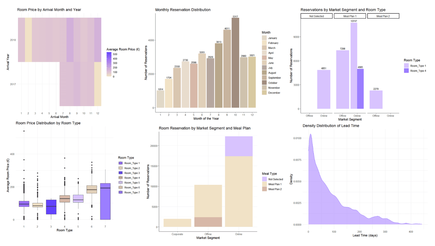
Various visualizations were created in Power BI to explore booking trends, pricing patterns, and seasonal variations. Key visualizations included:
Bar charts for Total Bookings by month.
Line charts highlighting weekends and holidays.
Boxplots showing price fluctuations by room type and meal plan.
Interactive Dashboards:
Interactive dashboards were built in Power BI, allowing users to drill down by date, room type, and market segment. These dashboards provided an overview of bookings, cancellations, and trends over time.
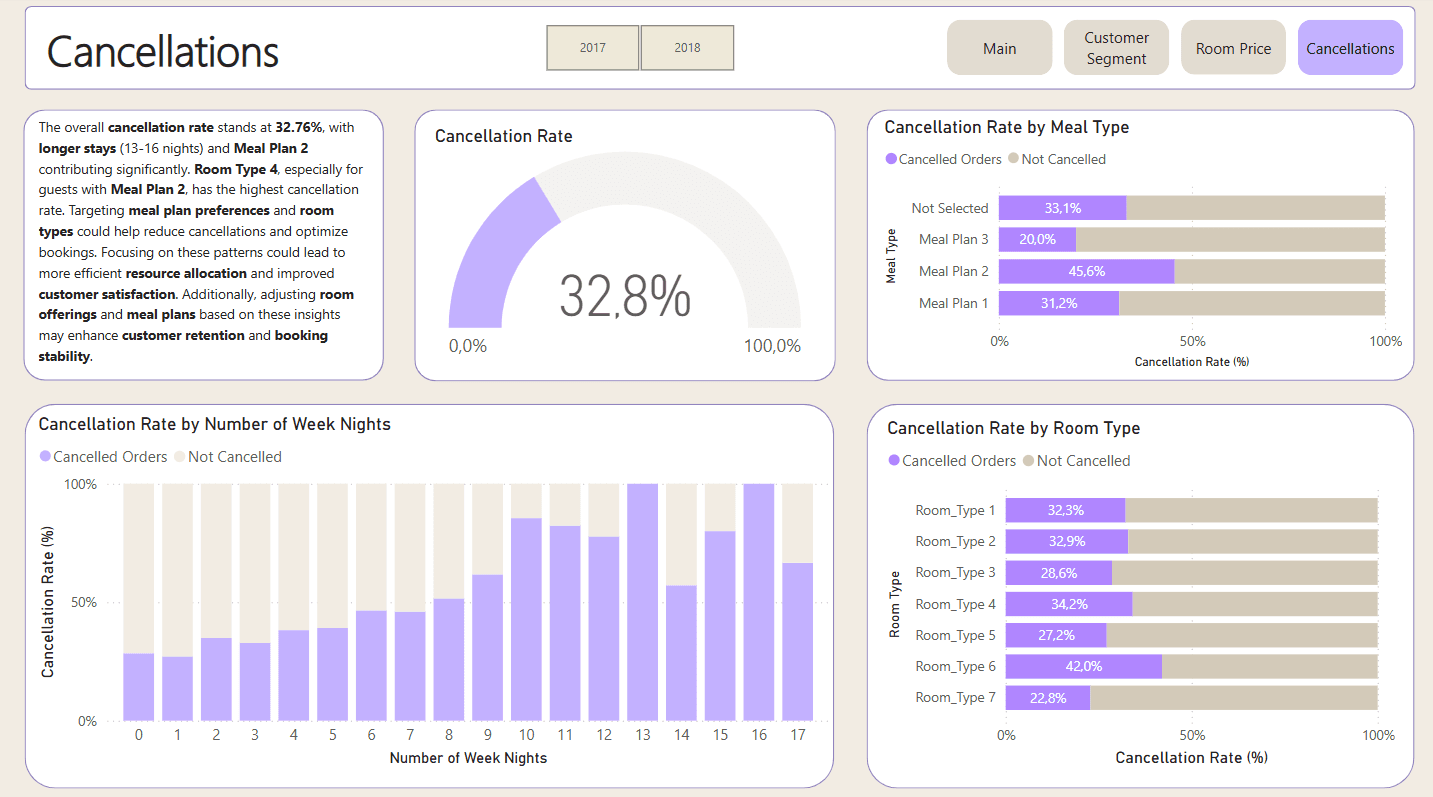
Key Findings:
⭐ Total Bookings are most concentrated in the first half of the month, with significant peaks towards the end. However, peak booking days do not coincide with weekends, and this varies from year to year.
⭐ Weekend Bookings: While weekends are important for bookings, the overall distribution shows a strong variation year by year. Different months such as October and November show higher booking volumes during weekends.
⭐ Cancellation Rate: The cancellation rate stands at 32.76%, with longer stays (13-16 nights) and Meal Plan 2 contributing significantly. Room Type 4 with Meal Plan 2 has the highest cancellation rate.
Learning and Value Creation:
By focusing on high-demand periods (peak booking days), hotels can optimize pricing and offer promotions to increase revenue.
Segmenting bookings based on room types and meal plans can provide deeper insights into customer preferences.
A more targeted approach to handling cancellations, especially for longer stays and specific meal plans, could help reduce losses.
Links:
Purchasing Behavior Analysis Using R
Structure and Scope of the Dataset:
Number of records: 2240
Number of fields: 29
Data fields: Id, Year_Birth, Education, Marital_Status, Income, Kidhome, Teenhome, Dt_Customer, Recency, MntWines, MntFruits, MntMeatProducts, MntFishProducts, MntSweetProducts, MntGoldProds, NumDealsPurchases, NumWebPurchases, NumCatalogPurchases, NumStorePurchases, NumWebVisitsMonth, AcceptedCmp3, AcceptedCmp4, AcceptedCmp5, AcceptedCmp1, AcceptedCmp2, Complain, Z_CostContact, Z_Revenue, Response.
License: Public domain
Tools and Technologies Used
🗂️📝 R (tidyverse, dplyr): For data cleaning, preparation, and analysis
📊 ggplot2: For creating detailed and interactive visualizations
📥readxl: For importing data from Excel files into R
📊 pastecs: For generating statistical summaries and descriptive statistics
🔄 tidyr: For reshaping and tidying data
🔄 reshape2: For transforming the data from wide to long format to facilitate analysis

Data Processing and Analysis:
Cleaning and Structuring the Data:
The dataset contained inconsistencies, missing values, and unstructured formats. I addressed these challenges by:
✨ Standardizing numerical and categorical variables, such as converting inconsistent formats in purchase channels and demographic data
✨ Removing outliers and handling missing values using statistical imputation (e.g., median or average)
✨ Restructuring the dataset for visualization by pivoting and grouping key variables
Converting variables to „factor” type:
factorType <- c(’Response’, 'Complain’, 'AcceptedCmp1′, 'AcceptedCmp2′, 'AcceptedCmp3′, 'AcceptedCmp4′, 'AcceptedCmp5′)
clients[factorType] <- lapply(clients[factorType], function(x) factor(x, levels = c(0, 1), labels = c(0, 1)))

#Analyzing Correlation
cor_vars <- clients %>%
select(Income, MntWines, MntFruits, MntMeatProducts, MntFishProducts, MntSweetProducts, MntGoldProds, Recency)
correlation_matrix <- cor(cor_vars, use = „complete.obs”, method = „pearson”)
print(correlation_matrix)
Convert the correlation matrix to a long format
cor_melted <- melt(correlation_matrix)
ggplot(cor_melted, aes(Var1, Var2, fill = value)) +
geom_tile() +
geom_text(aes(label = round(value, 2)), color = „black”, size = 4) +
scale_fill_gradient2(low = „white”, high = „#084081”, mid = „white”, midpoint = 0) +
labs(title = „Correlation Heatmap”, x = „”, y = „”) +
theme_minimal() +
theme(axis.text.x = element_text(angle = 90, hjust = 1))
Data Visualization and Exploration:
✨ Used R’s powerful visualization tools to uncover patterns, trends, and actionable insights.
✨ Created bar charts and visualized demographic impacts on purchases (e.g., children in households vs. total purchases).
✨ Applied color palettes (e.g., BuPu and PuBu palettes) for intuitive differentiation across categories.


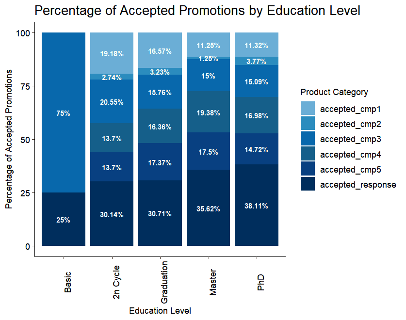
Key Findings
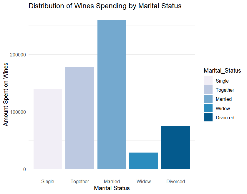
⭐ Household Structure: Families without children make more purchases, especially in physical stores. Conversely, households with more children show reduced purchasing activity, especially online.
⭐ Demographic Insights: Singles and high-income groups respond better to promotions, while families show varying behaviors depending on income and household size.
⭐ Recency Effect: Customers who purchased recently tend to spend more on high-value products like wine and meat.
⭐ Purchase Patterns: Significant trends were observed in how families shop, including preferences for specific product categories and channels.
Learning and Value Creation
This project enhanced my practical skills in data cleaning, analysis, and visualization using R. I learned to manage complex, unstructured datasets and draw meaningful insights that align with business needs
Through this work, I developed a deeper understanding of purchasing behaviors and improved my ability to communicate findings effectively through data visualization. These skills are directly applicable to solving real-world business problems and driving data-driven decision-making.
Github Link
Are you interested in learning more about how I can contribute to your organization with my data analysis skills? I am always open to new opportunities and challenges. Feel free to reach out for further discussion or if you have any questions about my projects.