A new Power BI update is out. As usual, I am focusing on the changes that I personally find the most interesting from a day-to-day reporting and data modeling perspective.
Custom totals in tables and matrix (preview)
This is probably one of the most awaited changes for Power BI developers.
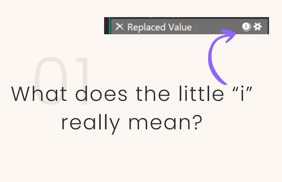
For years there have been countless memes about how Power BI calculates totals. Users see values in the rows, quickly sum them in their heads and expect a certain result. The total shows something different because the measure is evaluated in a different filter context. Technically correct. From a business perspective, often confusing.

In practice this meant writing additional measures just to control the total behaviour. ISINSCOPE patterns, SUMX over visible elements, special logic. It worked, but it made models more complex and harder to maintain.
Custom totals finally introduce a real choice. Now we can actually decide how totals should behave. The total can be calculated for example as:
• Sum
• Min
• Max
• Count
• Count (Distinct)

This gives much more control directly in the visual, without writing extra DAX just to “fix” totals.

Fewer DAX workarounds, less explaining to users why numbers “do not match”, and simpler long-term maintenance.
Series label leader lines for line charts
Line charts now support leader lines connecting series labels to the actual data points. A small change, but it makes line charts much easier to read when many series are shown. Leader lines help users quickly understand which label belongs to which line, especially in dense or overlapping scenarios. You can also control the colour and visibility of labels, giving more control over overall visual clarity.

In practice this means we can often reduce or even remove legends and keep the visual cleaner. In executive dashboards where clarity matters, this is a useful addition.
Modern visual defaults and theme changes (Preview)
Power BI is introducing new default visual styles aligned with Fluent design. New reports should look more modern out of the box, with improved spacing, typography and colour behaviour.
Personally, this makes me a bit cautious. In many projects I rely on heavily customised themes. Changes to default styling or inheritance rules might require theme updates. It is definitely something worth testing before starting new projects or updating existing reports.
Conditional formatting for Input slicer
The Input slicer allows users to type in a numeric parameter such as a KPI target, alert threshold or simulation value. Now its appearance can change dynamically based on the entered value.
Elements that support conditional formatting include:
Filters: Text color, Dismiss button color
Filter operator: Text and icon color
Apply button: Icon color
Input box: Placeholder text color and accent bar color
Background and border colors for each element.

For example, the slicer background can turn red if the value is outside an acceptable range or green if it meets expectations. It is a small UX improvement, but it gives users immediate feedback without forcing them to analyse multiple visuals.
User-defined functions in DAX (Preview)
The ability to create custom functions in DAX is a significant step towards more structured and modular modeling. Until now, logic was often duplicated across measures or hidden inside calculation groups.
User-defined functions allow defining logic once and reusing it across the model. In larger semantic models this can improve readability, reduce errors and make refactoring easier.

Briefly on other directions
Direct Lake in OneLake has reached General Availability. It represents another architectural option in Fabric, enabling analytics without traditional dataset import and with reduced reliance on DirectQuery in selected large-scale scenarios.

TMDL view in web modeling is now available in preview. Being able to edit the semantic model definition as text directly in the browser supports team collaboration, Git integration and deployment automation.
While not a single headline feature in this release, Microsoft continues to move towards more translytical scenarios, where reports are increasingly used not only for analysis but also to trigger operational actions or workflows.
More information
The full list of changes is available on the Microsoft website. Images and visual materials come from official Microsoft sources.
https://powerbi.microsoft.com/en-us/blog/power-bi-march-2026-feature-summary
February update are here: Power BI Update: February 2026